Photo Books - Creative Techniques
Introduction
The photo book is by many creatives considered the best way to publish printed photographs. It captures the essence of the photographers intent and offers many design possibilities.
In this article, I’d like to provide five creative techniques and inspiration for photo book projects.
5 Creative Techniques
1. Collection Scanning - Identifying a Theme
In case you struggle to find a theme, I recommend repeatedly going through your whole collection of images while listening to your favorite records.
Take notes and try do identify reoccurring subjects, perspectives, locations or emotions.
If your images are mostly digital, you can start copying images that “belong together” into a folder. Don’t constrict yourself by a too rational approach. Even if two images seem to not be connected, but you feel like they belong together, go with it. This might indicate a creative impulse worth exploring.
Importing your body of work in a single image reviewing program like Photo Mechanic can speed up the process considerably.
This is how an imported image collection looks like in Photo Mechanic. The program is unrivaled in speed and can work with hundreds of thousands of images easily.
2. Multimedia Brainstorming - Broaden the Scope
After identifying a general theme in the body of work, I recommend using what I like to call “Multimedia Brainstorming”. It is very similar to regular Brainstorming but adding more creative opportunities.
Start by writing one term that the defines the general starting point / theme you’ve already identified on a blank sheet of paper. Continue adding all the words and thoughts that come to your mind. Connect them to the starting term or related term with simple lines. Don’t leave emotions out of the picture. They are important ingredients and should definitely be written down.
Now consider adding objects and photographs (e.g. Instax prints) to the collage that you find fitting. I recommend reviewing the collage the next day and continue working on it.
You will find that the true theme or underlying themes become clearer in the process. Maybe you find yourself discarding some branches of the collage and feel the need to explore other branches by creating new photographs for it. This is exactly what’s meant to happen until you are completely aware of what your photo book should be about.
Start small and get big. An A4-sized sheet of paper might be a good starting point.
3. Get Real - Defining the Flow
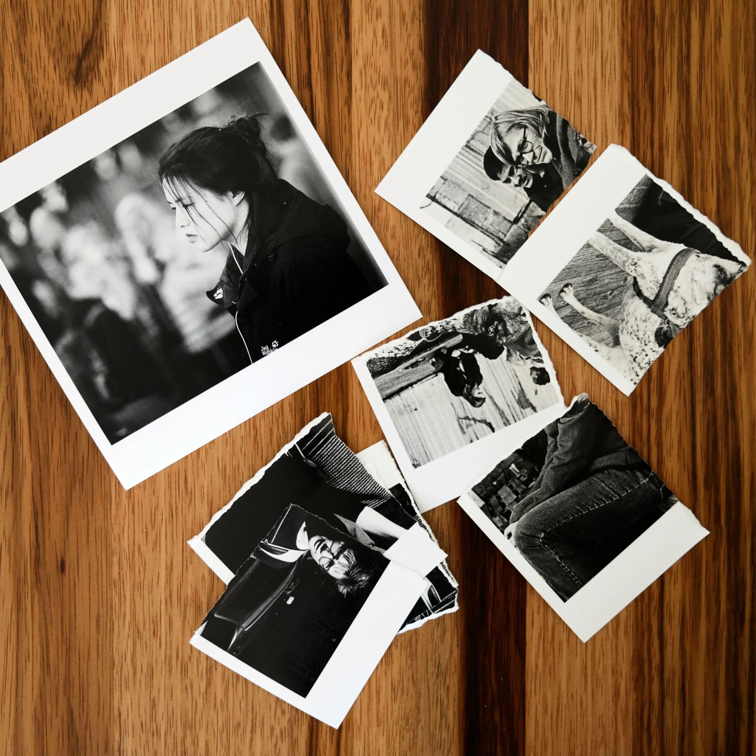
Continue by selecting a few images and print them. Really cheap prints are fine.
As I’ve decided for a square book format early on, it was only natural for the prints to be square as well.
By creating physical objects you get something to manipulate and carry with you. It makes the process of selecting images and arranging them for the photo book much more engaging. The fact that at least a little money and more consideration goes into every image improves the decision making process.
I also like the fact that real prints can be shown to friends, glued to pages of mockup versions of the book or stuck on the refrigerator. It makes the process much more tangible.
Don’t hesitate to get rid of images that don’t fit. It is a creative process and urges should be followed.
4. Off-Design - The Cover
While it is a tried and tested practice to put an image from the book on the cover, it is worth considering a completely different approach: “Off-Design”.
“Off-Design” is about creating cover art that is related to the content but does not show any of the photographs from within. Creating another Multimedia Mind Map might be a good starting point.
I’ve decided to go with a minimalist cover design incorporating three important aspects of street photography: People as subjects, the process as a personal journey and the focus on the quintessential.
5. Acid Test - Peer Review
After creating a first version of the book in a design software, it is a good idea to order a proof from services like Blurb.
With the proof in hand, go to fellow photographers with similar styles and different styles. Ask for their opinion over a cup of coffee. It is important to inquire how they feel about the book and which message it conveys to them.
It is not about getting remarks like “It’s nice” or “The photographs are sharp”. Be investigative and take notes.
Take your time to analyze the feedback and check whether their interpretations overlap with your creative intentions. Consider asking additional people for their thoughts, if you feel like the results so far were inconclusive.
Final Words
Creating photo books is a creative process, so be creative. If my techniques don’t speak to you, come up with your own. Have fun in the process and be aware that you will encounter a “creative rut” at some point. Being aware of possible frustrations helps to overcome them.


