
MTF Test Chart – Final Destination
All good things come by three – this seems to be true for test charts as well. After the unusable Forex chart and the large batch of paper charts with compression artifacts, I’ve got some great news:
The third run of test charts is now suitable for providing accurate MTF measurements!
A Few Details
The new test charts are printed on 200g/m2 matte paper and exhibit very high edge acutance.
In order to allow the testing of optical systems from wide (around 20mm) to very long focal lengths (up to 600mm), I ordered three different chart sizes: A2, A1 and A0.
According to my calculations, a printed test chart has to be at least A2 to allow for reasonably accurate MTF measurements.
Just to illustrate, when testing a 600mm lens with a 35mm imaging system, the required distance to the test chart is around 10 meters. Therefore, a big – or to be more precise: a long - studio is required to test such an imaging system.
In any case, even if I would have preferred to work with charts smaller than A2 in order to reduce the working distance when testing such long focal lengths, this wouldn’t have been feasible as the accuracy and validity of the results would have suffered.
As I’ve written before, the bigger the test chart, the better, as the impact of aliasing effects present on the test chart (inevitable) then carry less weight.
Way Ahead
Although it does not sound like much, the solution of the test chart issue is a big step in the right direction.
I’ve already got a long list of things I want to test besides lenses. For example, have you ever wondered how much a UV filter reduces the resolving power of your highßend lens? Well, I certainly have and now I can measure it and share the results with the world.
Stay tuned!
MTF Test Chart – A New Hope
In my previous blog post, I described the quality issues I had with the first MTF test chart printed on Forex. A few weeks later, the replacement paper charts arrived – unfortunately they are also unusable.
Upon closer examination, I noticed that the JPEG compression algorithm (Lanczos-3, in this case) added an outline to the trapezoids used for calculating the modulation transfer function.
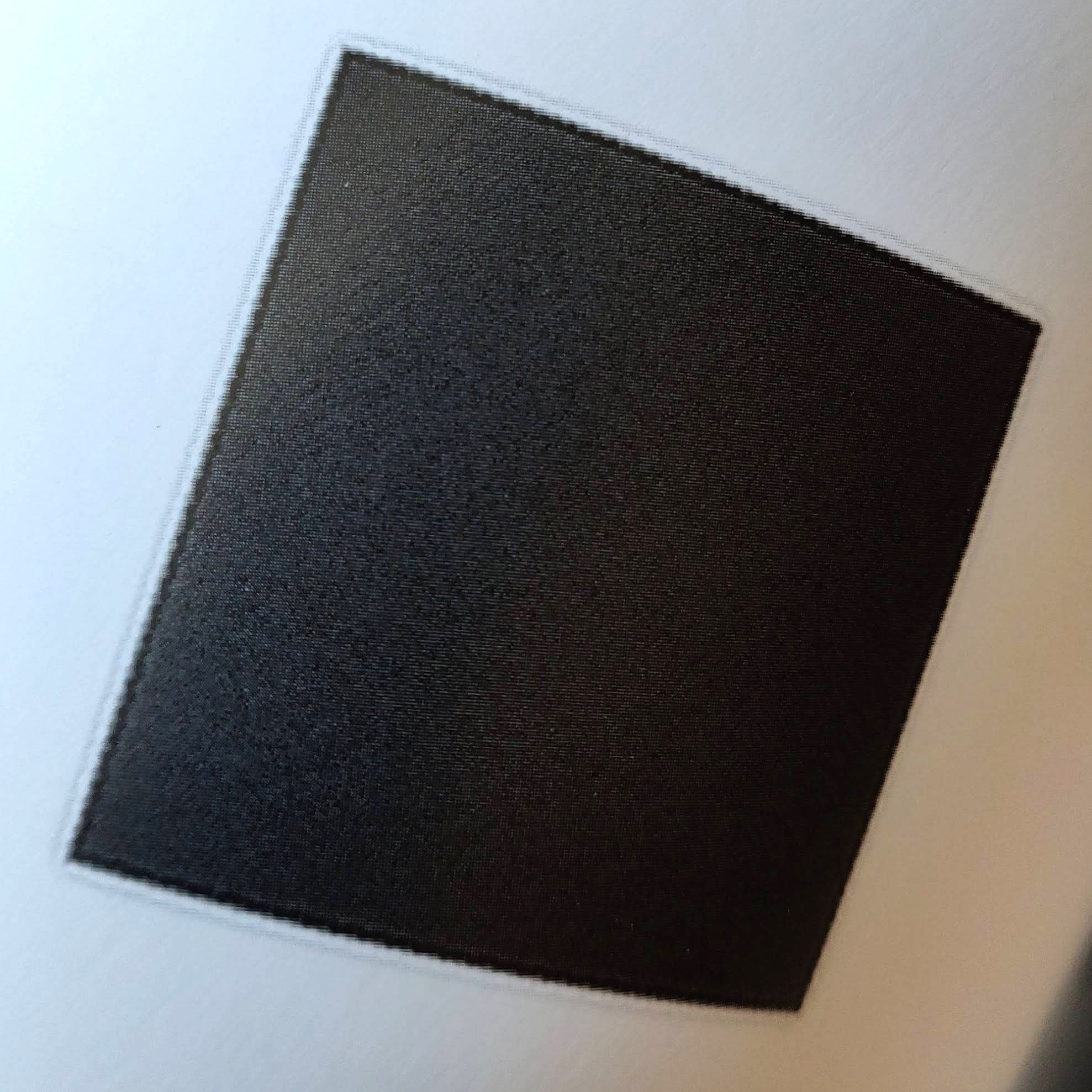
Double edge = two bumps on the MTF chart.
Again, much like the lack of edge acutance of the Forex chart, the defect is barely visible to the naked eye, but would influence the lens- and camera test results.
The replacements are already ordered, this time I’ve sent the printer a PDF file instead of a JPEG and I’ve double-checked the edges.
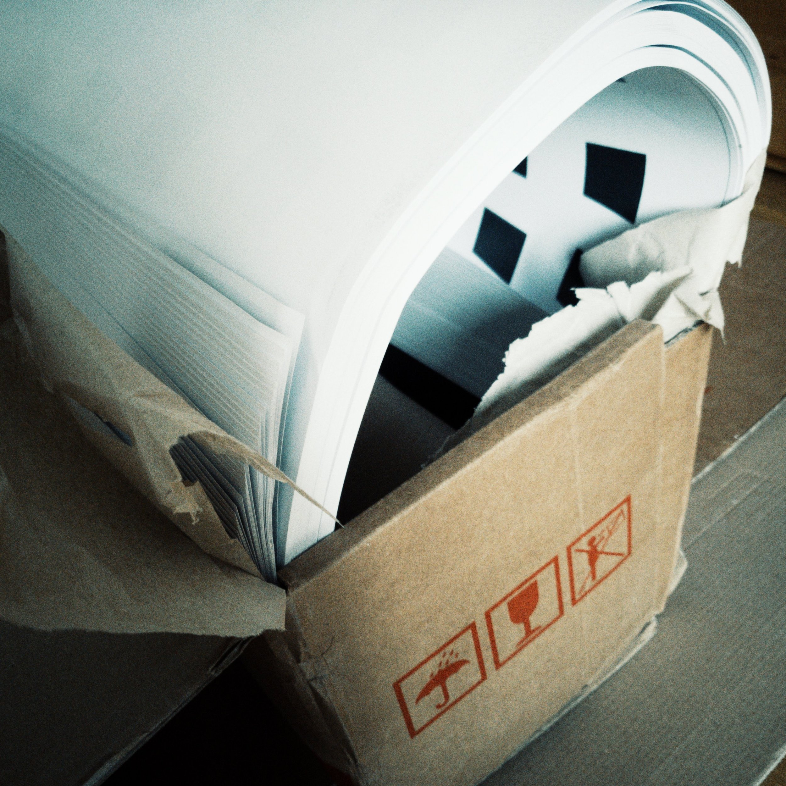
What to do with 100 sheets of high quality prints sized 120x85cm? Well, I’ve got a decent supply of very expensive wrapping paper for the foreseeable future.

MTF Test Chart – Quality Control
I recently ordered a custom made test chart from a reputable photo lab for measuring the modulation transfer function of various imaging systems to provide unbiased, highly accurate data for future articles here on the site and on YouTube.
Bottom line upfront: The quality of the chart was not sufficient, and here is how I found out:
The Chart
The rule of thumb is: The bigger the test chart, the better the results. I therefore ordered a chart sized approximately 85x60 cm printed on Forex.

The Forex-chart.
And there is the rub – Forex is essentially fancy plastic and it has a slightly structured surface. This negatively impacts acutance of the black trapezoids, which serve as the slanted edge targets. The effect is almost not visible to the naked eye, but under the linen tester it was very obvious.
So I already knew that the chart won’t suffice, but I decided to test how big of an issue it was in practice.
The Test
For the test, I photographed the chart with an OM System OM-1 + Leica DG Summilux 25mm f/1.4 from various distances and compared the cycles per pixel-values of the same group of test patterns across the various photos.
The RAW files were processed in MakeTIFF to create a linear, relatively “untouched” TIFF.
MTF Mapper was used to calculate the following MTF values in cycles/pixel.
Distance to chart: 100cm
Distance to chart: 150cm
Distance to chart: 250cm
Evaluation
With increasing distance, the MTF values increased as well. This is indicative of poor test chart quality, and here is why:
The further the distance from the chart, the smaller the slanted edge targets in the frame. When the targets decrease in size, their fuzzy edges decrease in size as well. Therefore, the edges increase in acutance which positively affects the result of the MTF calculation.
Obviously, you want high edge acutance. If the test chart is of bad quality, you cannot resolve the issue in practice, because the distance to the chart is determined by the field of view.
Closing Remarks
Photographing a test chart at various distances and comparing the MTF results is an easy, reliable way to determine the quality of a test chart.
Note that some lenses exhibit varying performance depending on the focusing distance, so if you are unsure, test a given chart with different lenses and compare the results.
Also keep in mind that a high resolution imaging system can only be reliably tested utilizing targets of highest print quality and acutance.
Therefore, I’ve already ordered some replacement charts – this time targets printed on paper. The Forex target will serve as a fancy prop or cutting mat – I haven’t made up my mind yet. Decisions, decisions.